Design Tips to Help You Brand Your Events

Estimated reading time:
1 minute
A strong brand reinforces who you are, and often dictates how you’re perceived. Branding your business has the power to make you more likeable, and should be well-suited to the target audience you’re trying to reach.
We can’t tell you what your brand should be, of course. But we can help you present the events on your website so that your brand shines through on each page. When a user’s experience with you is branded from start to finish it leaves them with a strong and accurate impression of who you are.
Read on to learn five key features of our products that will help you portray your brand on your single-event pages, calendar views, tickets, and follow-up emails.
Colors
One quick and easy way to brand your events is by including your brand’s unique colors.
The Events Calendar plugins are designed to be monochrome upon installation, as we didn’t want to assume a color that might clash with your brand. But our plugins are intentionally customizable, so you can easily select a color scheme that suits your brand’s needs, without any coding involved.
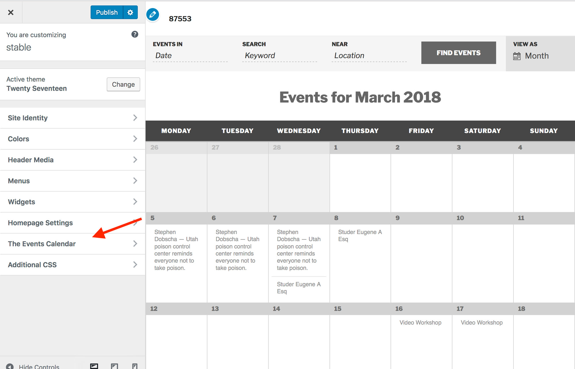
In the “Customize” tab in the admin bar, you’ll find an option for The Events Calendar. Within The Events Calendar tab you’ll have a “General Theme” and “Global Elements” section where you can assign colors to a few basic features including links, filter bar and buttons for all of your event pages.
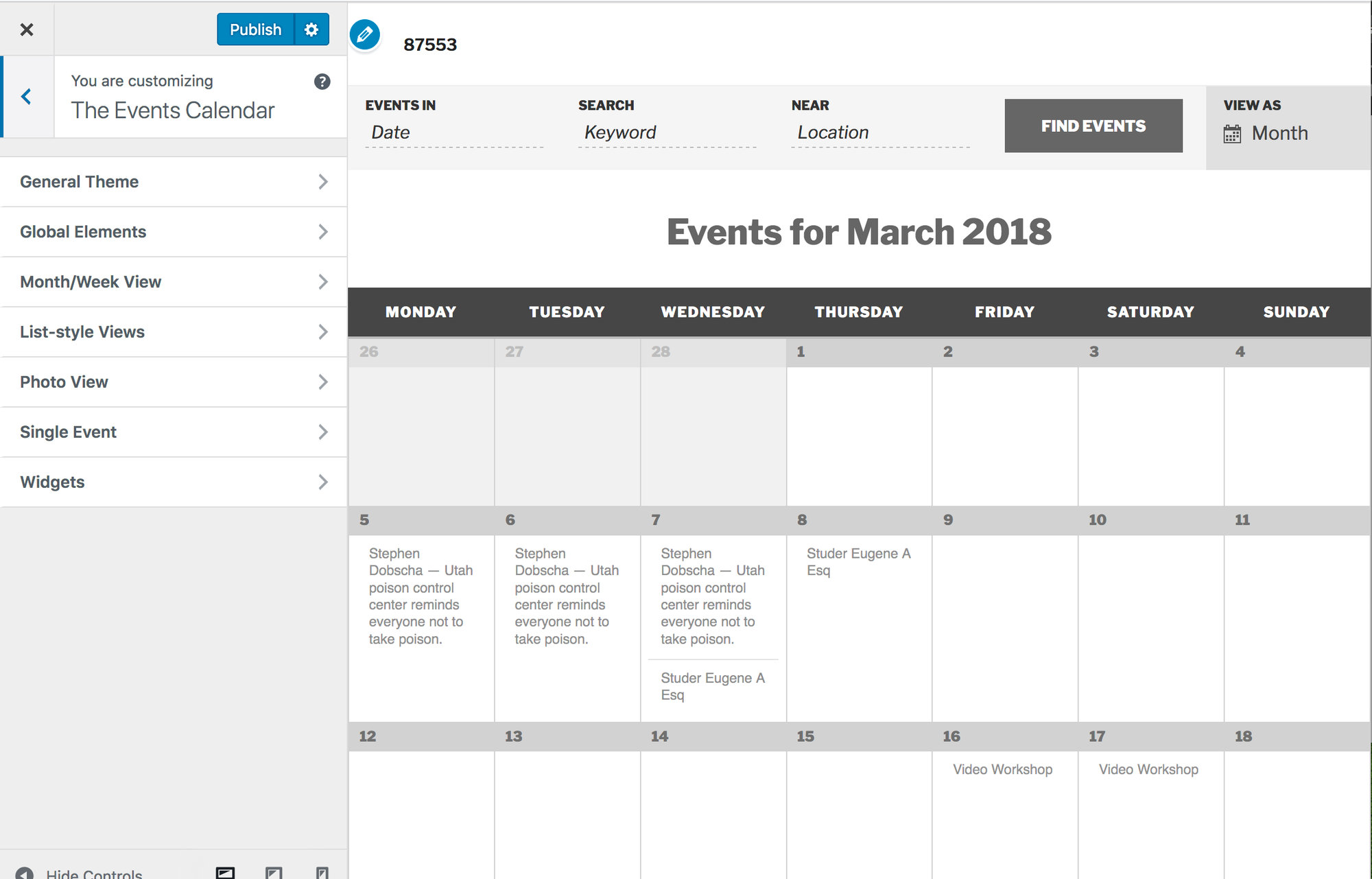
Below, you’ll see sections for “single event” along with the calendar view options. Colors chosen in these sections will override the general theme for those pages. We strongly recommend you use the same color scheme on all of your event pages.
Customizing your colors is the first step in making your events calendar feel like your very own.
Typography
Fonts are another feature of your event pages that have the power to strongly portray your brand. Fonts can be serious and factual, formal and elegant, or even simple and relaxed.
By default, The Events Calendar uses the fonts dictated by your active theme. But with so many free, commercial, and custom-built themes out there, we can’t guarantee the fonts will always be correctly sized and styled to your brand’s specifications. That’s why we’ve provided a Knowledgebase article to guide you on implementing custom CSS for your events calendar, which can be useful for correcting any issues with how your site’s fonts are displaying on the events calendar. You can find that article here.
Content
The copy on each of your event pages is a great opportunity to convey the tone and voice of your brand. By reading what you have to say—and how you say it—people get a feeling for the personality of your brand.
If your brand is elegant and sophisticated, you should use formal language and meticulously ensure your grammar and vocabulary are choices are on-point. If your brand is simple and fun, using more casual language and throwing in a joke or two is a great way to build a connection with your audience on a more personal level.
Don’t underestimate any written content—the tone and voice of your brand can impact every last detail of your site. For example, let’s say you were listing some key details about an event on your event, like when it’s starting and its venue. You could simply preface these pieces of information with “When:” and “Where:”. But maybe it’ll feel more natural for your brand to use “Arrival:” and “Venue:” instead (if it’s a bit more formal), or “The Place:” and “The Time:” (if it’s a bit more casual).
All of these word choices matter when it comes to writing in your brand’s voice. For a deeper dive on this—including how to find your brand’s voice—check out this article by Harriet Cummings.
Process
Being mindful of the functionality in your event navigation and/or registration process is a fun way to ramp up your branding.
For example, if your brand has a heavy international focus, guests might love Events Calendar PRO’s Map View so they can see the events you are hosting across the world (check out a live demo of the Map View here).
Even if you’re not adding features, it’s important to walk through the process your user will take and make sure each step is cohesive with your brand. If you’ve portrayed “simplicity” throughout your site in your branding, you might want to reconsider an exceptionally long, detailed registration form. As another example, if your brand is family-friendly, have you acknowledged what role kids will play (if any) in your event descriptions?
Small things like this are a great way to take your branding one step further, and make you stand out amongst the crowd.
Images
When it comes to branding, images are your best friend. Images have the ability to convey the feeling or vibe of your brand much more accurately than words ever could. Adjectives you might use to describe your brand will be much more easily understandable through images than they would be through words.
Each of your events should include a featured image. For the best results, decide on a theme for your images, whether it be color scheme, feeling, subject, or all of the above. This way, when readers are browsing through your calendar, they’ll see one unified brand portrayed across all your events.
You can even bring your branding to the PDF tickets your attendees receive upon registration (If you don’t have the free PDF tickets extension yet, download it here). You can add a featured image to your PDF ticket by clicking on “Settings” in the Event Tickets section of your event and selecting a “Ticket Header Image”.
Include images whenever possible on your event pages. An event page without an image is a lost opportunity to make an emotional connection to your audience!
Conclusion
Whatever features you use, colors you pick , and word choices you make on your event pages, the most important thing to remember is to be cohesive. Go through the process and make sure your branding is consistent in all of these features, on every page. Don’t make the mistake of going in one direction with your images, and a totally different one with the tone and voice of your written content.
Portraying a solid brand throughout each element of your site will leave visitors with a strong and lasting impression of who you are.

Jaime
View author page