How We Make Our WordPress Plugins More Accessible
Estimated reading time:
1 minute
Accessibility is a top priority for our team at The Events Calendar. In honor of Global Accessibility Awareness Day, we want to share a behind-the-scenes look at some of the ways we’ve made our WordPress calendar plugins more accessible for all users.
We’re always striving to make our products more inclusive, and we’re proud of the strides we’ve made in creating plugins for all people with all abilities. Here’s a look at some of the ways our plugins put accessibility first.
1. We choose colors with accessibility in mind.
We’re careful to design our products with strategically contrasting colors. Color contrast can help people with visual impairments use our products without straining as they read.
The goal in color contrast is to achieve a contrast ratio between foreground and background colors that earns at least an AA or AAA grade according to the Web Content Accessibility Guidelines (WCAG). The higher the contrast, the higher the grade!
Luckily, there are tools to help scan and audit contrasts. One of those tools, the Accessible Color Generator, helped us find the right shade of blue for The Events Calendar’s default primary color so that we hit at a WCAG AA rating.
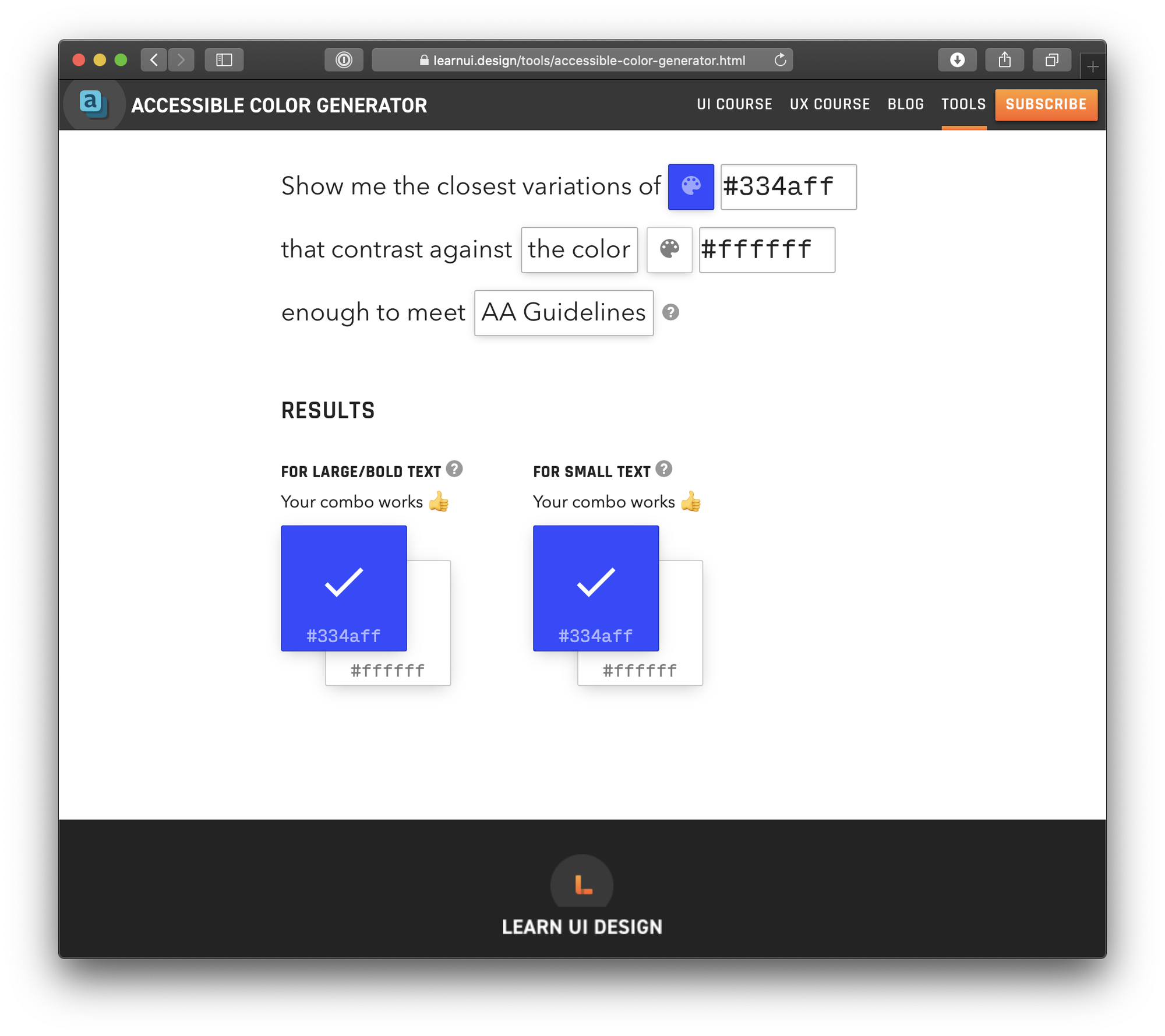
That’s a great start, but we also know color isn’t the only factor that impacts contrast. Font sizes are also crucial: Contrast should increase as text gets smaller. As a result, we created our designs with a minimum font size to maintain our rating. You’ll see what we mean when you look at the buttons in the calendar user interface.

But what we chose for our plugin isn’t always what ends up on a user’s site. If you customize your calendar and switch up the colors, make sure you’re maintaining a good WCAG contrast rating. In addition to the Accessible Color Generator, here are two other tools to help you create good contrast:
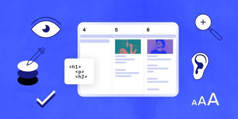
2. We use semantic HTML markup to help people that use assistive technology have a great experience with our products.
Did you know that many schools and universities are required by law to make their websites accessible? We do, because lots of colleges and universities use our plugins. That’s why we take extra care to write clean code that uses proper semantics and attributes to help screenreaders read the calendar out loud.
That means we wrap things like navigation in a <nav> element and headers in a <header> element. It might seem small and obvious, but attention to detail is crucial when it comes to ensuring accessibility for all users, including people who rely on screenreaders.
We also use ARIA attributes to help assistive technology identify and interpret different types of content. Here are a few examples of the attributes you’ll find throughout the plugin:
- aria-label: Provides a label that the screenreader reads on elements that don’t have a discernible label, like a close button that uses “X” instead of “Close” as the label.
- aria-readonly: For elements that cannot be edited, like our calendar’s month view container, which a screenreader might recognize as an editable element without the attribute.
- aria-live: Used on elements displayed on a page after the page loads; particularly useful for errors or information the screenreader should be aware of.
- aria-controls: For interactive elements that affect other things on the page, like tabs where clicking controls the content that is displayed on the screen.
- aria-hidden: Tells assistive technology to simply not announce a specific element.
There are others, too, and you’ll find those ARIA attributes throughout the plugin.
3. We properly hide things
Hiding things in CSS is easy, right? Slap display: none; on an element and it magically goes away!
But what if a screenreader skips over something important that we hid with CSS?
Screenreaders will pass over anything with display: none; on it. So instead of relying on that, we use an accessible class to hide an element from a page in a way that assistive technology can still read:
.a11y-hidden {
border: 0;
clip: rect(0 0 0 0);
height: 1px;
margin: -1px;
overflow: hidden;
padding: 0;
position: absolute;
width:1px;
}
This works by changing the height of an element to a single pixel, then “clipping” it out of view. So, the element is still there — it’s just hiding without interfering with other things on the page.The A11Y Project has a great overview of this technique and why it’s considered the gold standard for hiding things without sacrificing accessibility.
4. We make it easy to navigate with a keyboard
Navigating a calendar with a keyboard can be tricky. Take the calendar’s month view, for example: You need a way to navigate not just day to day, but inside of a day with multiple events.
We use the tabindex attribute to make sure keyboard users can navigate the calendar in the correct order by pressing the “Tab” button. There are instances where we might need to tab to an element then be able to tab through the content inside of it. That’s where setting tabindex=”-1” comes into play. We use that on widgets, like the datepicker. By setting a negative value, the datepicker can be accessed with the tab key, but the items inside won’t be included in the tabbing order, unless the datepicker is opened up.

Jaime
View author page