Behind the Scenes: A New Look for The Events Calendar Brand
Estimated reading time:
1 minute
You may have noticed a new look around here, and we’re not just talking about our updated calendar views. In addition to rolling out a makeover for The Events Calendar, we’re excited to present a new look for our brand altogether, complete with a new logo, an expanded color palette, and a fresh new style for icons and other visuals.
Want to take a peek behind the scenes of a visual brand refresh? It’s your lucky day: In this post, we’re sharing the nitty gritty of how we updated the look of our brand, just in time for the 10-year anniversary of The Events Calendar.
First things first: Why did you decide to update the brand now?
For starters, it was high time for an update. After nearly a decade with the same logo and color palette, we were ready for something new. Ten years ago there was no iPad, Instagram didn’t exist yet, and neither Stripe nor Square had been invented, so it’s safe to say things have changed in that time.
We were inspired to freshen up our brand image as we got to work on updating the look and feel of our flagship product, The Events Calendar.
The calendar redesign was all about modernizing, streamlining, and beautifying the look of our calendar so that our users and their visitors could have a better (and better-looking) calendar. As we designed our new calendar views, we started to reflect on the look of our overall brand, and we realized a few things. Namely:
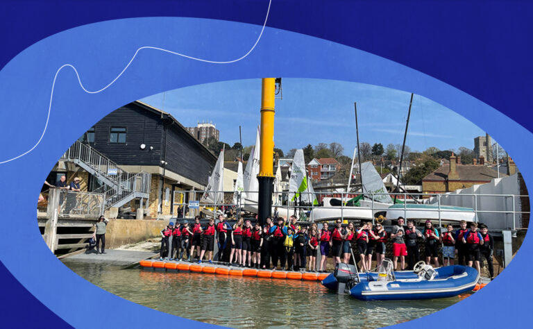
- Over the years, our users have evolved. In the early days, we catered mostly to developers. But as WordPress has grown, so too has its user base, and now our products are used by hundreds of thousands of people around the world with different jobs and roles, from developers to event planners and business owners to agencies. It’s important for our brand to be representative of all our distinct users.
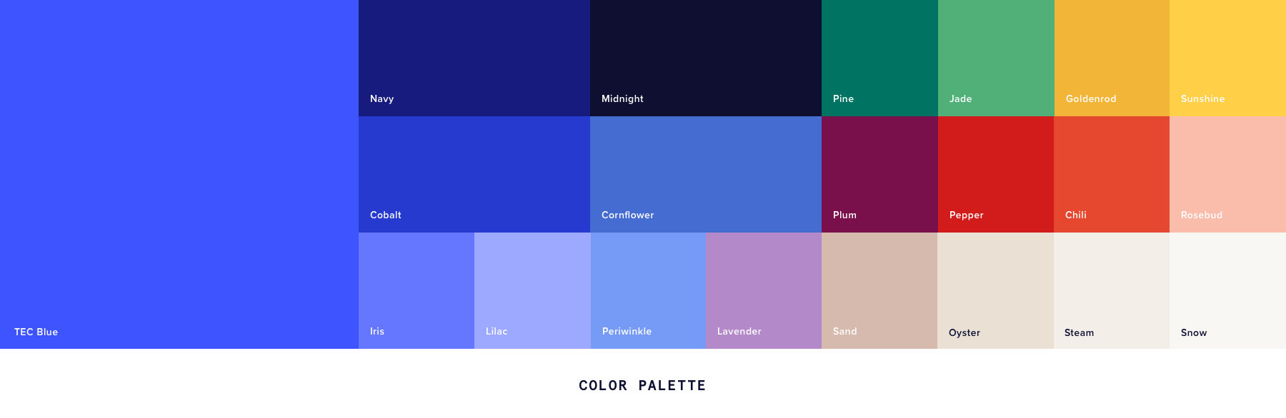
- Our colors—dark blue and black—felt a little corporate and generic in a sea of tech brands with corporate, generic color palettes. We didn’t want to throw away our entire identity, but we knew it was time to introduce a little more color to our world.
- It wasn’t just our users that evolved over the years—it was us, too. What used to be a company dedicated to a single calendar plugin now offers an entire suite of event management tools, from ticketing solutions to email marketing. We needed to do some soul searching to define The Events Calendar as the “parent” brand to all of our products, instead of thinking of it solely as a calendar plugin.
What changed in the refresh?
Here are the major updates you’ll likely notice:
- An extended color palette. Blue and black still play a starring role in our palette, but they’re no longer the only colors we depend on. Our updated palette features a mix of colors you might call “organic”—think warm tones and neutrals, in addition to the dark, strong colors we’re known for. Tech companies can sometimes feel a little cold and distant, but we’re in the business of facilitating events that create real connections between people; the exact opposite of “cold” and “distant.” This new, warmer color palette does a better job conveying our values and our mission.
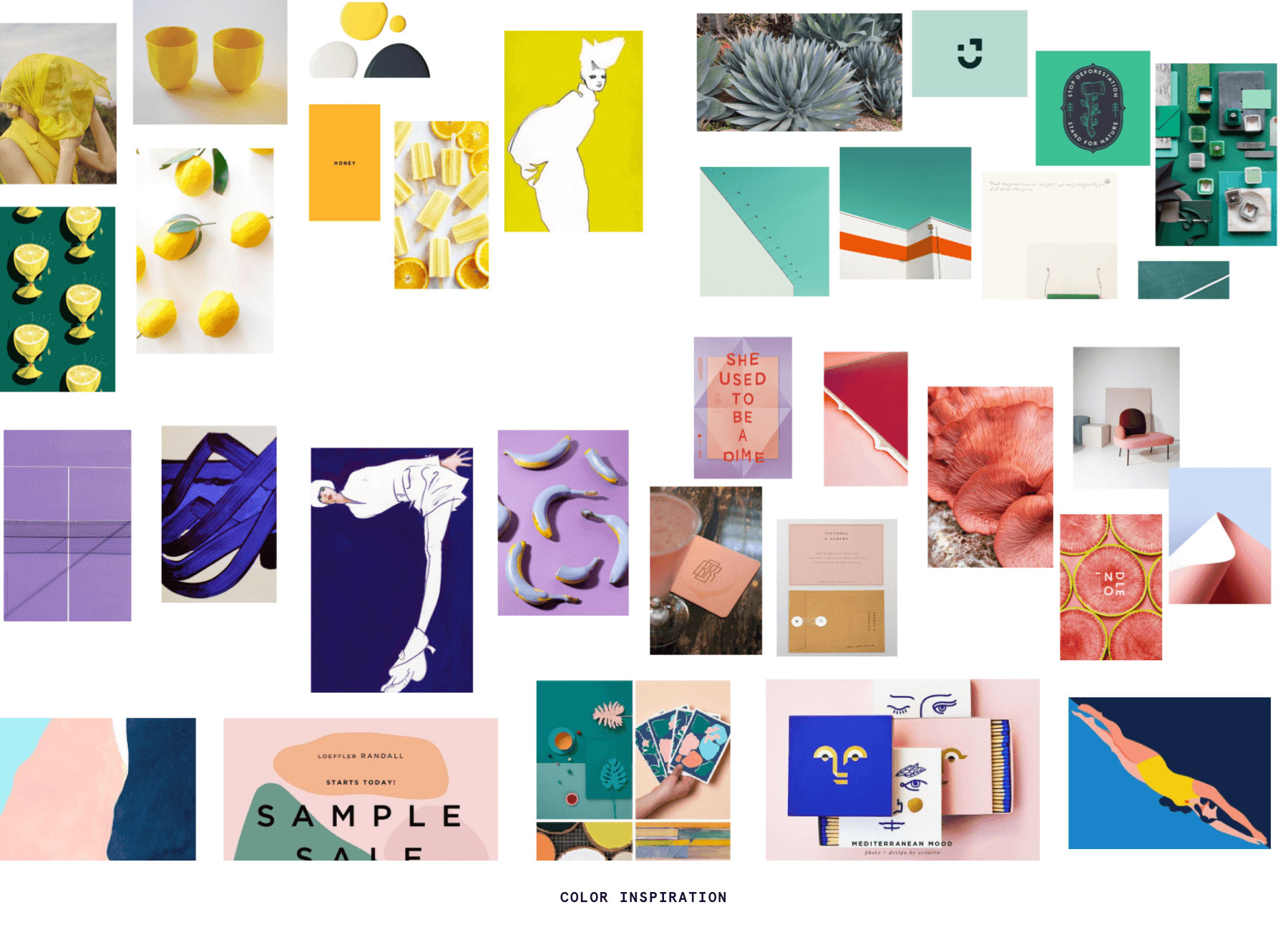
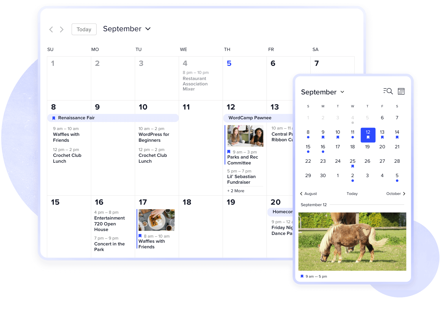
- More playful images and icons. Our new approach to illustrations is more dynamic and flexible. This means we can draw from a wider range of inspiration, mixing photography, illustration, and typography to tell the story of our brand.
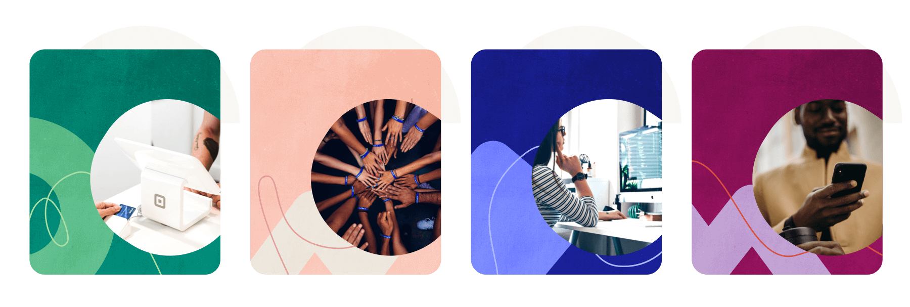
One of our new motifs is simple shapes (we refer to it as confetti). Confetti is versatile: We can use it as a container for imagery, or layered on top of other elements to create dynamic graphics.
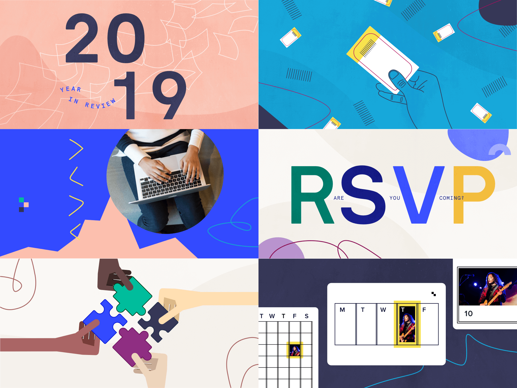
You’ll also notice that our new iconography is simple, lively, and playful with a sense of movement and dimensionality. We had fun incorporating new elements like the lightning bolt, which represents our plugins that have both free and premium versions.
![]()
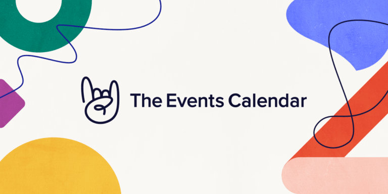
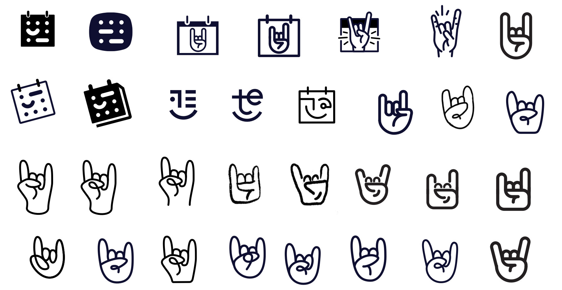
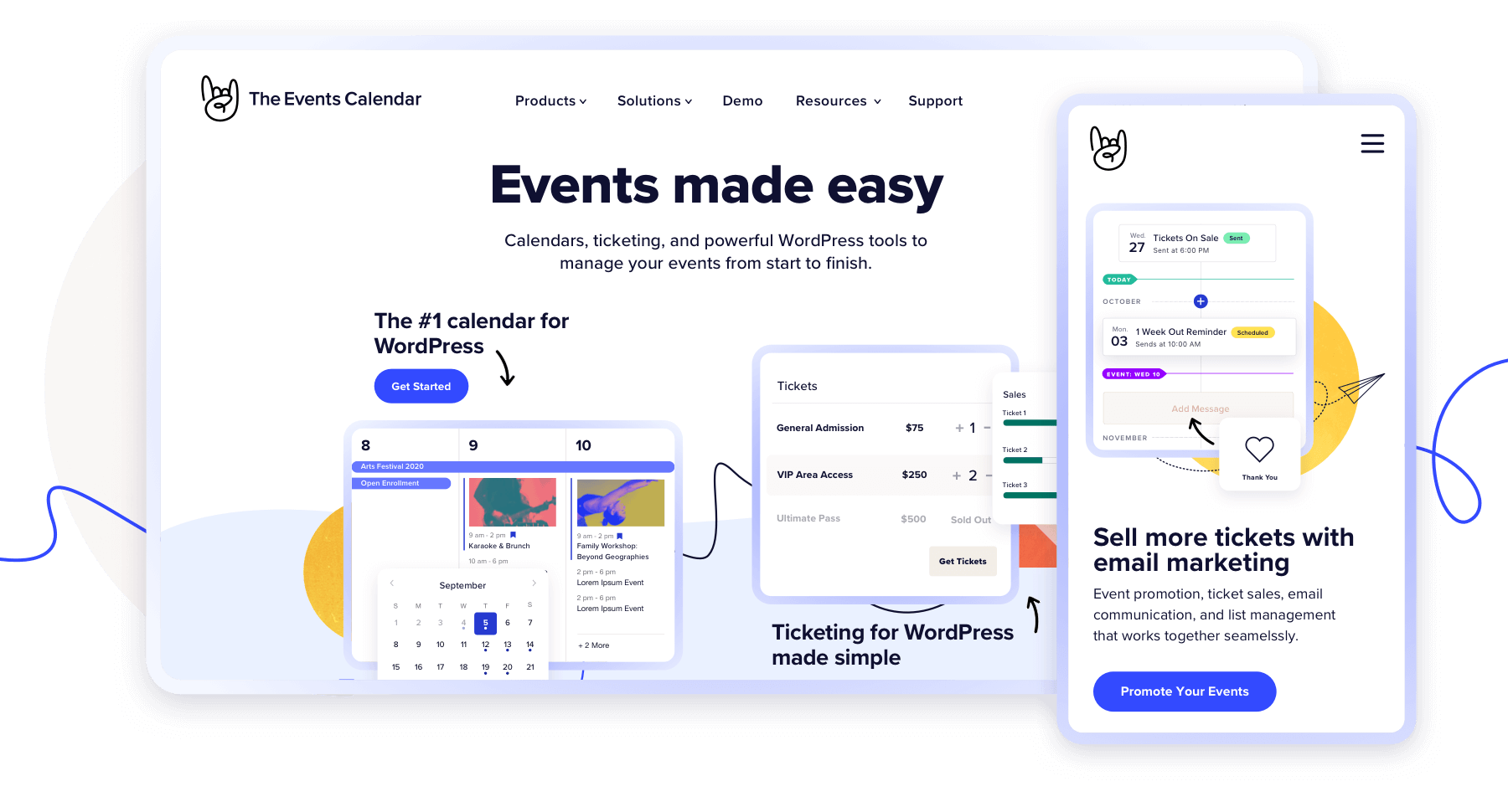
- An updated logo. Our previous logo, featuring our trademark “rock on” hands (we call them horns) against a spiral-bound calendar, made sense when we were just a calendar plugin. But these days, we’re more than just a calendar. The Events Calendar is an entire suite of event planning tools, including ticketing, crowdsourcing, event promotion, and more. Our new logo needed to be broad enough to reflect everything we do. This more playful illustration style matches our new brand image, which is more human and less rigid.
![]()
Okay, but the “horns” in the logo. What’s that all about? Why was it so important to preserve?
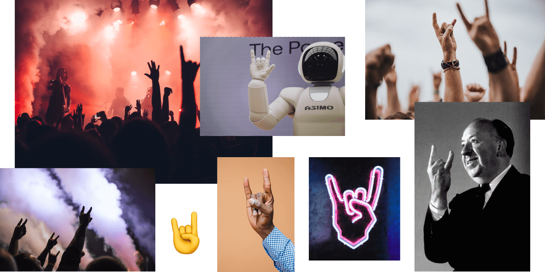
Good question. For us, the horns are a hallmark of our brand. They’ve long served as a symbol of our enthusiastic and slightly irreverent spirit.
The horns also represent quality products that are worth getting excited about. Taken literally, the symbol also evokes attendees at events. The horns are no longer relegated to Norwegian Black Metal shows – people flash the symbol at concerts of all genres, sporting events, comic cons and more. What better image to represent a brand that’s all about events?
How did you actually implement the new look?
We’re a scrappy and fully remote team at The Events Calendar, which means we don’t have the luxury of holistically overhauling all of our assets at once.
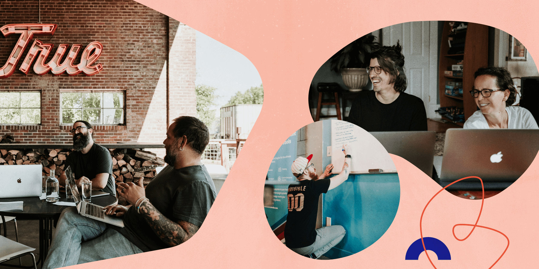
But it’s not all bad news. Working at a small/mid-size tech company just means we have to prioritize which pages and assets we want to update first. For us, that meant starting with our homepage, then moving on to other high-value touchpoints on our site (like the pages for our most popular products), our social media channels, and our pages on WordPress.org. Once we had those pieces in place, we began rolling out our new assets throughout the rest of our site, and we’ll continue to update our other properties in the weeks to come.
Did you hit any obstacles while putting together the new brand?
It’s always a challenge to gather feedback from multiple stakeholders on something as subjective as creative work. Not everyone uses the same language to express their likes, their dislikes, and why something works (or doesn’t work) for them.
One of our biggest challenges was finding a way to gather feedback regularly as a remote team. So, we experimented: First, we shared our work in a presentation and talked through everyone’s feedback as a group. For the second round of work, we shared an Invision board where team members could leave comments. By the third time we presented to the group, we decided to share a survey link with specific questions to guide responses and make sure we all addressed the same questions and priorities. The survey was a useful way to separate personal preference from meaningful, concrete feedback that we could use to land on a direction that everybody felt great about.
How did you decide when the new look was finished and ready to go live?
Unveiling a new look for an established brand is a little nerve-wracking, to be honest. Hitting “publish” on our updated assets required confidence, and at some point, we simply had to rip the bandaid off and move forward.
That’s a tough call to make, especially for a team of creatives that are always looking for ways to improve: What if we upped the saturation on that photo a little bit? How about we try a slightly different font color? But those kinds of tweaks and changes can go on indefinitely if you’re not careful; we all know that better is the enemy of done. We feel great about the new look, but we also embrace that our brand will always be a work in progress. It’s the same way we approach development for our products: We remain rooted in our core mission and our identity as a brand, but we’re always evolving and always flexible.

Jaime
View author page