The Events Calendar loads its own stylesheets to control the appearance of the calendar. This article covers every supported method for customizing those styles — from a quick rule in the WordPress Customizer to replacing the plugin’s stylesheets entirely — along with CSS custom properties, the container-based breakpoint system, and the CSS classes available for targeting specific views.
There are three ways to add custom CSS to The Events Calendar. They differ in how persistent they are, how much flexibility they offer, and whether they survive theme updates.
Using the WordPress Customizer
Go to Appearance → Customize → Additional CSS in the WordPress dashboard and add your rules there. Rules are stored in the database and apply site-wide. This is the right choice for a quick one-off tweak. For larger or more complex sets of rules, the stylesheet file approach below is easier to maintain and won’t be lost if you switch themes.
Add a Custom Stylesheet in Your Child Theme (Recommended)
The Events Calendar automatically loads a file named tribe-events.css from a tribe-events/ folder in your active theme, if one exists. This file loads in addition to — not instead of — the plugin’s stylesheets, so you only need to write rules for the things you want to change.
⚠️ Always use a child theme. If you add this file to a parent theme it will be deleted the next time the theme updates. See How to Create a Child Theme (and Why) before proceeding.
Step 1: Create the tribe-events Folder
In your child theme’s folder, create a folder called tribe-events if one doesn’t already exist:
your-child-theme/
└── tribe-events/
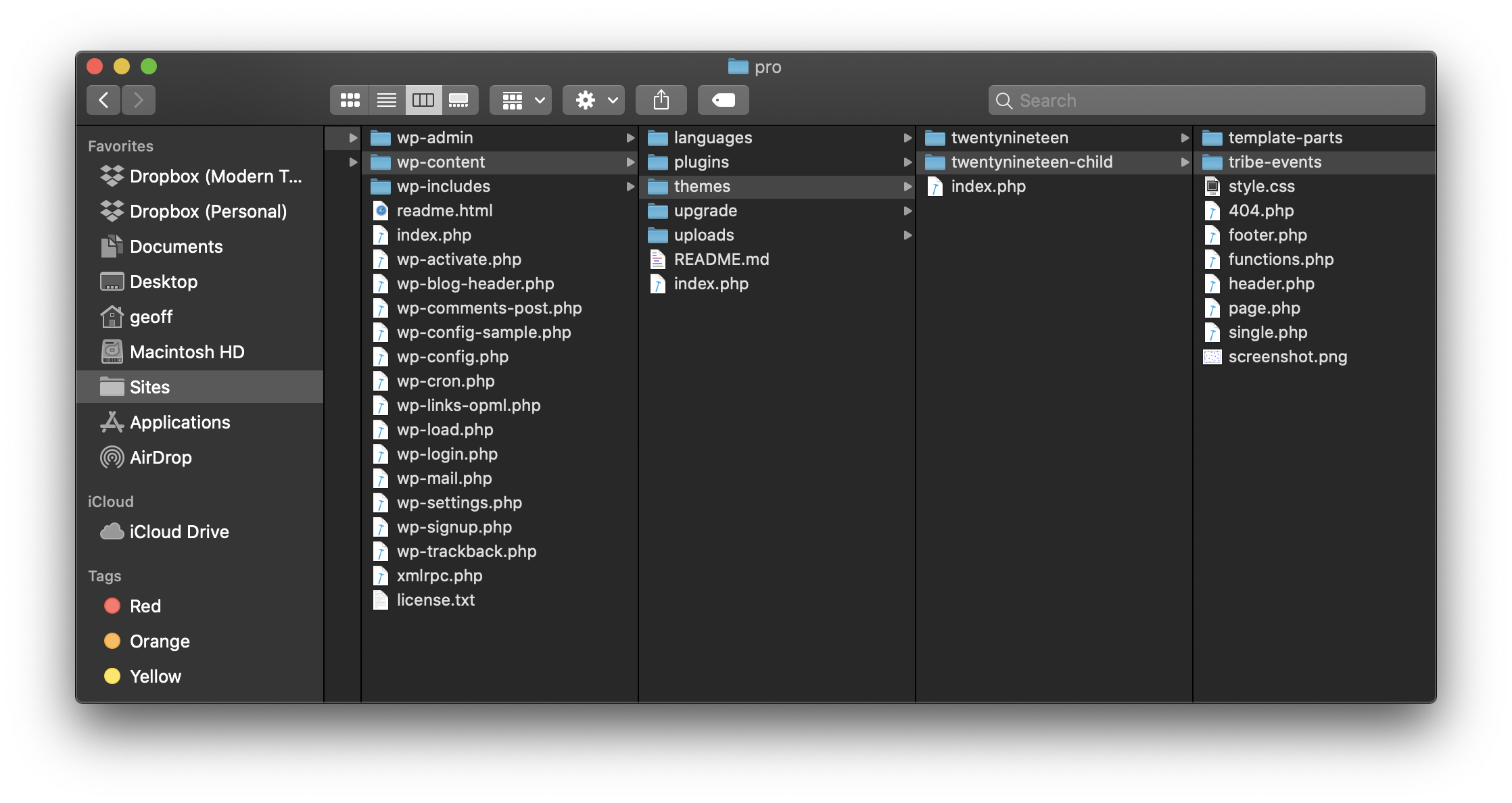
Step 2: Create tribe-events.css
Inside that folder, create an empty file named tribe-events.css. Start blank and add only the rules you want to override.
your-child-theme/
└── tribe-events/
    └── tribe-events.css
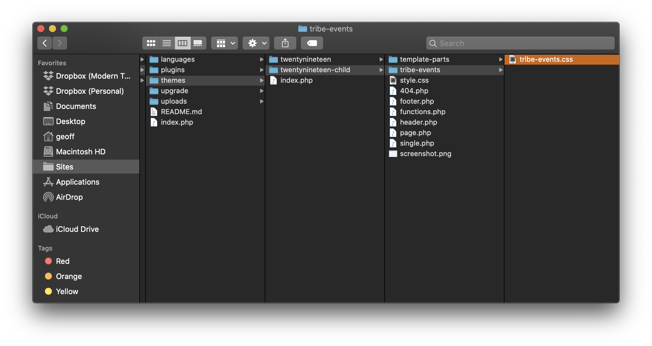
TEC detects and loads this file automatically — no registration or enqueueing needed.
Example: Changing the Month View Background Color
Open your browser’s developer tools (F12, or right-click and choose Inspect) and click on the calendar element you want to target to find its CSS class.
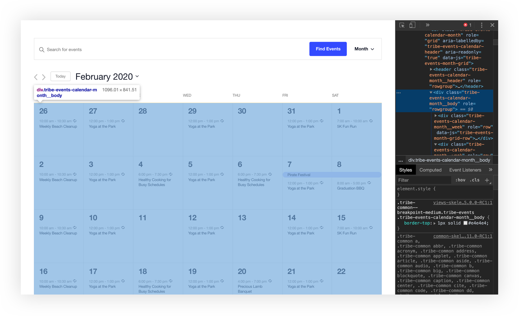
Add a rule targeting that class to your tribe-events.css file:
.tribe-common--breakpoint-medium.tribe-events .tribe-events-calendar-month__body {
    background-color: #f5f6ff;
}
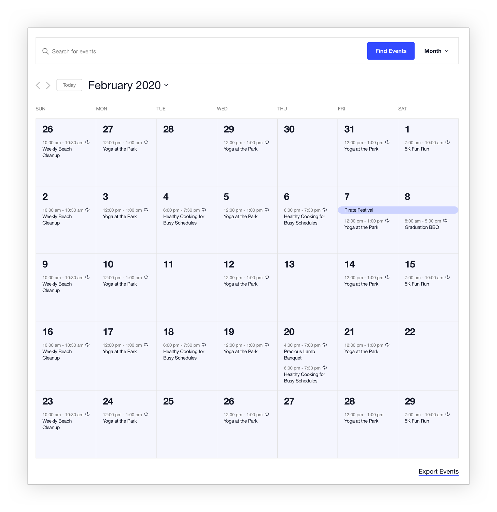
The same pattern applies to any element across any view.
Tips for Finding the Right Classes
TEC’s CSS classes follow a modified BEM naming convention — descriptive names with a consistent structure you can often predict without opening DevTools:
.tribe-events-calendar-month__[element]
.tribe-events-calendar-month__[element]--[modifier]
The double underscore (__) separates a block from its element; the double hyphen (--) separates an element from its modifier. So .tribe-events-calendar-month__calendar-event-title targets event titles in Month View, and .tribe-events-calendar-month__day--past targets past-day cells.
A few other things to know:
- Specificity matters. If your rule isn’t taking effect, the plugin’s rule may be more specific. Try increasing your selector’s specificity, or use
!importantas a last resort. - Use DevTools to verify. The Styles panel shows which rules are applied and which are overridden (shown with a strikethrough).
- The
.tribe-common--breakpoint-mediumprefix controls desktop vs. mobile styles. See the Breakpoints section below for a full explanation.
Adding CSS Directly to Your Child Theme’s Stylesheet
You can also add rules directly to your child theme’s style.css file. This is fine if you already have a child theme set up and prefer to keep all your styles in one place. As with the tribe-events.css approach, only add styles to a child theme — never to a parent theme.
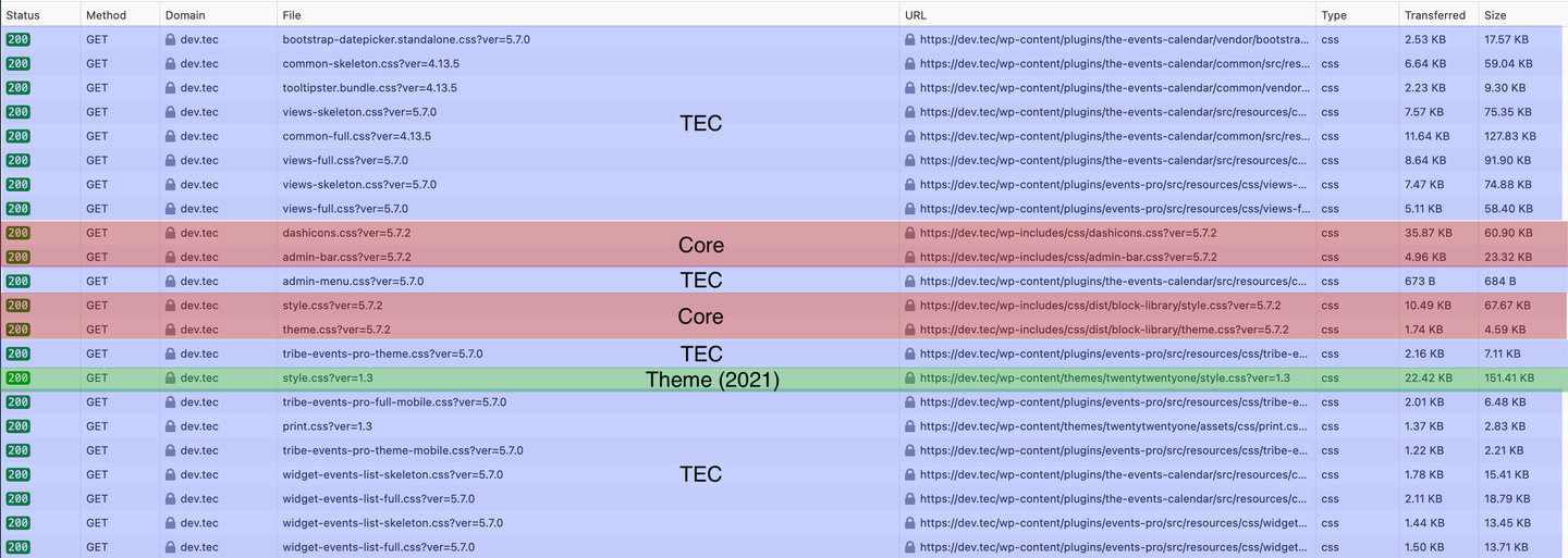
Stylesheet Filenames and Locations
The following table lists the correct filename and theme folder for each plugin’s stylesheet override. These files load alongside the plugin’s stylesheets, not instead of them.
| Plugin | Stylesheet Name | Theme Location |
|---|---|---|
| The Events Calendar | tribe-events.css | /tribe-events |
| Events Calendar Pro | tribe-events-pro.css | /tribe-events/pro |
| Calendar Widget | widget-calendar.css | /tribe-events/pro |
| Event Tickets | tickets.css | /tribe-events/tickets |
| Community Events | tribe-events-community.css | /tribe-events/community |
TEC also offers two built-in stylesheet levels to choose from under Events → Settings → Display:
- Skeleton Styles — only the CSS needed for complex layouts like calendar and week view grids
- Tribe Events Styles — more detailed layouts, relying more heavily on plugin styles
Replacing Default Stylesheets Entirely
If you want to replace TEC’s stylesheets rather than add to them, use wp_deregister_style() rather than wp_dequeue_style(). TEC registers stylesheets before enqueueing them, so wp_dequeue_style() only works some of the time. The following snippet disables the main built-in styles for The Events Calendar and Events Calendar Pro:
function deregister_tribe_styles() {
    wp_deregister_style( 'tribe-events-pro-views-v2-skeleton' );
    wp_deregister_style( 'tribe-events-pro-views-v2-full' );
    wp_deregister_style( 'tribe-events-views-v2-skeleton' );
    wp_deregister_style( 'tribe-events-views-v2-full' );
    wp_deregister_style( 'tribe-common-skeleton-style' );
    wp_deregister_style( 'tribe-common-full-style' );
}
add_action( 'wp_enqueue_scripts', 'deregister_tribe_styles', 1 );
After deregistering, use wp_enqueue_style() in a separate function to load your own styles.
CSS Custom Properties
The Events Calendar styles elements with CSS, and those stylesheets are loaded in a particular order. Because CSS cares about ordering, styles later in the load order carry greater weight. TEC loads its stylesheets after theme stylesheets where possible to prevent conflicts — but in cases where that isn’t possible, CSS custom properties (also known as CSS variables) provide an additional tool for overriding styles cleanly.
What Are CSS Custom Properties?
A custom property defines a variable and assigns a value to it:
--tec-color-accent-primary: #334aff;
That variable can then be referenced anywhere in the CSS:
.tribe-common .tribe-common-c-svgicon {
    color: var(--tec-color-accent-primary);
}
This is equivalent to:
.tribe-common .tribe-common-c-svgicon {
    color: #334aff;
}
The difference is that when the variable’s value changes, that change propagates everywhere the variable is used — no need to hunt down individual selectors.
How to Use Them
Instead of targeting a specific CSS class and overriding its color value, you can redefine the custom property on the document :root element. This changes the value everywhere it’s used across the entire calendar:
:root {
    --tec-color-accent-primary: #f00;
}
Add this to your tribe-events.css file or the Customizer’s Additional CSS panel.
💡 Custom property styles only load on event pages. If you plan to reference a TEC custom property on a non-event page — for example, for a custom element in a sidebar — be aware the variable may not be defined there.1
Why TEC Uses Custom Properties
- As a site owner — add a small amount of CSS to change TEC styles across the entire site, or target a specific instance.
- As a theme creator — bundle styles that affect TEC to match your theme, without hardcoding selectors.
- As a plugin author — override the base styles or incorporate them into your plugin in either direction.
Example: Change the Primary Button Color
To style a custom button to match TEC’s button color, reference the custom property rather than hardcoding the hex value:
.my-button {
    background-color: var(--tec-color-button-primary);
}
To change the color value itself for all TEC buttons at once:
:root {
    --tec-color-button-primary: #f8a100;
}
Or use the WordPress Customizer settings to change it without code.
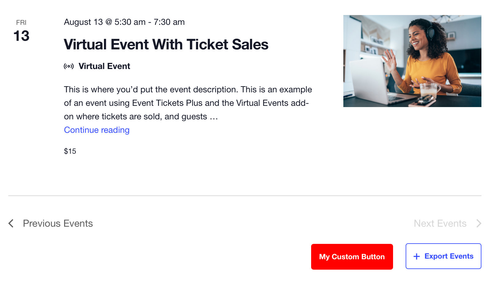
Example: Override a Custom Property on a Single Instance
Custom properties can be applied as inline styles on a specific HTML element, scoping the change to just that instance while leaving all other uses of the variable unchanged:
<button class="tribe-common-c-btn" name="custom-button" style="--tec-color-button-primary:red">My Custom Button</button>
Example: Changing a Custom Property with JavaScript
Custom properties can be updated by JavaScript at runtime. The following example listens for a click on a TEC button and swaps its color property on click:
document.addEventListener(
    'click',
    event => {
        if ( ! event.target.matches( '.tribe-common-c-btn' ) ) { return; }
        event.target.style.setProperty( '--tec-color-button-primary', 'red' );
    },
    false
);
Footnotes
1 TEC’s custom property styling doesn’t load on non-event pages. If you’re working with a custom element you plan to use outside event pages, avoid relying on a TEC custom property as it may not be defined in that context.
Breakpoints and Responsive Styles
TEC uses container-based breakpoints rather than traditional viewport media queries. This means responsiveness is determined by the width of the container the calendar is rendered in, not the width of the browser window. This allows the calendar to display correctly whether it’s on a full-width page, in a narrow sidebar widget, or embedded via shortcode.
Breakpoints are applied as CSS classes on the calendar container rather than via @media queries. The pattern looks like this:
.tribe-common--breakpoint-medium.tribe-events .myclass {
    display: none;
}
That rule applies when the calendar container is at the medium breakpoint (768px) or wider. Rules without a breakpoint prefix apply at all sizes including mobile.
Default Breakpoints
| Breakpoint name | Width (px) | CSS class prefix |
|---|---|---|
| Extra small | 500 | .tribe-common--breakpoint-xsmall |
| Medium | 768 | .tribe-common--breakpoint-medium |
| Large | 960 | .tribe-common--breakpoint-full |
Modifying Breakpoints
To change the pixel values of existing breakpoints, use the tribe_events_views_v2_view_breakpoints filter. You don’t need to include all breakpoints — only the ones you want to change. This affects all calendar views:
add_filter( 'tribe_events_views_v2_view_breakpoints', 'customize_tribe_events_breakpoints', 10, 2 );

function customize_tribe_events_breakpoints( $breakpoints, $view ) {
    $breakpoints['xsmall'] = 500;
    $breakpoints['medium'] = 768;
    $breakpoints['full']   = 960;

    return $breakpoints;
}
To modify breakpoints on only one view, use the view-specific filter instead. For example, to target List View only:
add_filter( 'tribe_events_views_v2_view_list_breakpoints', 'customize_tribe_events_breakpoints', 10, 2 );
Replace list with the slug of the view you want to target (month, day, week, photo, map, summary).
Adding New Breakpoints
You can define entirely new breakpoints using the same filter. The following adds an extra-large breakpoint at 1024px:
add_filter( 'tribe_events_views_v2_view_breakpoints', 'customize_tribe_events_breakpoints', 10, 2 );

function customize_tribe_events_breakpoints( $breakpoints, $view ) {
    $breakpoints['extra_large'] = 1024;

    return $breakpoints;
}
The new breakpoint class is then available in your CSS:
.tribe-common--breakpoint-extra_large.tribe-events .myclass {
    display: none;
}
Targeting Views with CSS Classes
The calendar views handle the display of calendar content, and no body classes are added to the page by default. If you need to target styles outside the calendar container itself, the following classes are available.
Body Classes
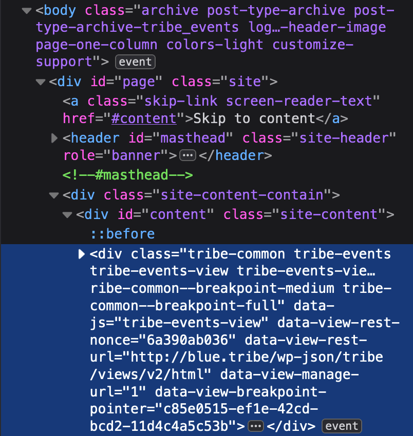
All calendar archive views add the same class to the <body> element:
.post-type-archive-tribe_events
Single event pages add:
.single-tribe_events
View Container Classes
Each calendar view wraps its content in a <div> that shares common classes across views but also carries one class unique to that view. This container class is the recommended way to scope CSS to a specific view.
| View | CSS Class |
|---|---|
| Month View | .tribe-events-view--month |
| List View | .tribe-events-view--list |
| Day View | .tribe-events-view--day |
| Week View (Pro) | .tribe-events-view--week |
| Map View (Pro) | .tribe-events-view--map |
| Photo View (Pro) | .tribe-events-view--photo |
| Summary View (Pro) | .tribe-events-view--summary |
These can be combined with other selectors to target elements within a specific view. For example, all views render individual events as <article> elements with the class .type-tribe_events. To change the background color of events only in Map View:
.tribe-events-view--map .type-tribe_events {
    background-color: #ff2052;
}