
Home › Forums › Calendar Products › Community Events › Formatting of Submit An Event Page
- This topic has 22 replies, 3 voices, and was last updated 10 years, 2 months ago by
Support Droid.
-
AuthorPosts
-
March 17, 2016 at 11:01 am #1090408
Laree Mancour
ParticipantIs there any way to improve the formatting of my Submit an Event page? Each field stretches across the entire screen, full justified. WordPress Theme is Trendy Travel.
I prefer it formats like the one below, left justified. Much cleaner.
March 18, 2016 at 3:23 am #1090830Brook
ParticipantHowdy Matthew,
I would love to help you with this. Could you provide a link to the page where the fields are stretched? Without being able to see it in my browser there is not much I can do, but if I can see I can probably provide you the exact CSS you will need to change the field width. From there you can just copy the CSS and paste it into any of your theme’s CSS files.
Does that sound like a good plan?
Cheers!
– Brook
March 18, 2016 at 7:06 pm #1091258ParticipantThis reply is private.
March 21, 2016 at 7:18 am #1091744ParticipantThank you Matt!
I see what’s going on now. Your theme has a script in place that swaps the HTML <select> element out for some custom divs. This will definitely impact the styling a good bit, and be fairly difficult to modify.
There is one workaround I can think of to modify their width without having to fight your theme’s styling:
table.tribe-community-event-info tr td:last-child { padding-right: 50%; }

body table.tribe-community-event-info tr td:first-child { padding-right: 0; }
Does that CSS do what you want? Our options are a bit limited with this theme, but it might just fit your needs perfectly!
Cheers!
– Brook
March 22, 2016 at 1:00 pm #1092580ParticipantBrook,
Well, it almost worked. It ended up modifying all the widths, including the Event Categories, while retaining the background widths.
Here’s a screenshot – http://localgetaways.com/wp-content/uploads/2016/03/screenshot.jpg
Any suggestions?
– Matt
March 23, 2016 at 3:28 am #1092782ParticipantThanks for getting back. Hmm that’s strange. The second line of CSS I shared should undo that for the categories. That’s the entire reason I added that line. Did you copy/paste both of them or perhaps just the first one?
- Brook
March 23, 2016 at 2:42 pm #1093144ParticipantBrook,
We tried adding all of your CSS code to the theme CSS code box and it had no effect. So we placed the code using developer tools to change the width, and it changed the width of most of the fields and text–not an improvement visually.
It still works, it just doesn’t look as pretty as your properly formatted template
So apparently there is no simple solution, but we’re open to other suggestions.
I’m happy to set you up with a username and password if you want to attempt a fix on your end.
Thanks Brook
– Matt
-
This reply was modified 10 years, 3 months ago by
March 24, 2016 at 5:38 am #1093331ParticipantThe only way to regain full control over the CSS styling is to either modify or strip out the portion of your theme that changes the standard <select> element to a custom <div> powered by JS. Currently it is basically swapping the usual HTML element for one of its own design, and I am not familiar enough with this nonstandard design to modify its width. The design itself forced 100% width on the element, and trying to modify that width is causing whacky behavior. Which is why I was walking you through modify the containing elements width, but as I said there is only so much we can do there.
The theme author might be familiar enough with this to help you modify, but it might also just be a library they’re using. So in the end even they might advise you to strip it out.
I’m sorry I can’t be of more help here. If you do have questions about our plugin or applying custom templates though I can definitely speak to that are of expertise. Just let me know.
Cheers!
– Brook
March 24, 2016 at 11:57 am #1093619ParticipantThanks for the feedback on this Brook. I’ll contact the theme developers and see if they have a solution.
– Matt
March 24, 2016 at 1:21 pm #1093653ParticipantBrook,
Another formatting issue, this time with the form calendar.
See this link: http://localgetaways.com/wp-content/uploads/2016/03/event-calendar-missing-sundays.jpg
You’ll notice that all Sundays are cut off on the calendar for April and May. This is causing a lot of confusion with customers uploading events (especially since most end on Sundays).
Suggestion?
– Matt
March 28, 2016 at 3:49 pm #1095005ParticipantHowdy Matt,
Were you able to fix this problem over the weekend? I am not seeing that issue on your site in Chrome or Firefox. In both browsers the entire calendar within the drop down displays uncropped, including Sunday.
– Brook
March 28, 2016 at 5:06 pm #1095063ParticipantBrook,
I checked it in three refreshed browsers (Chrome, IE, Firefox) with the history cleared and it’s still the same problem: Sundays are missing in the first two months. Please send me a screenshot of what your seeing.
– Matt
March 28, 2016 at 11:18 pm #1095249ParticipantHowdy Matthew,
I’m happy to do that. Here is one from Chrome:
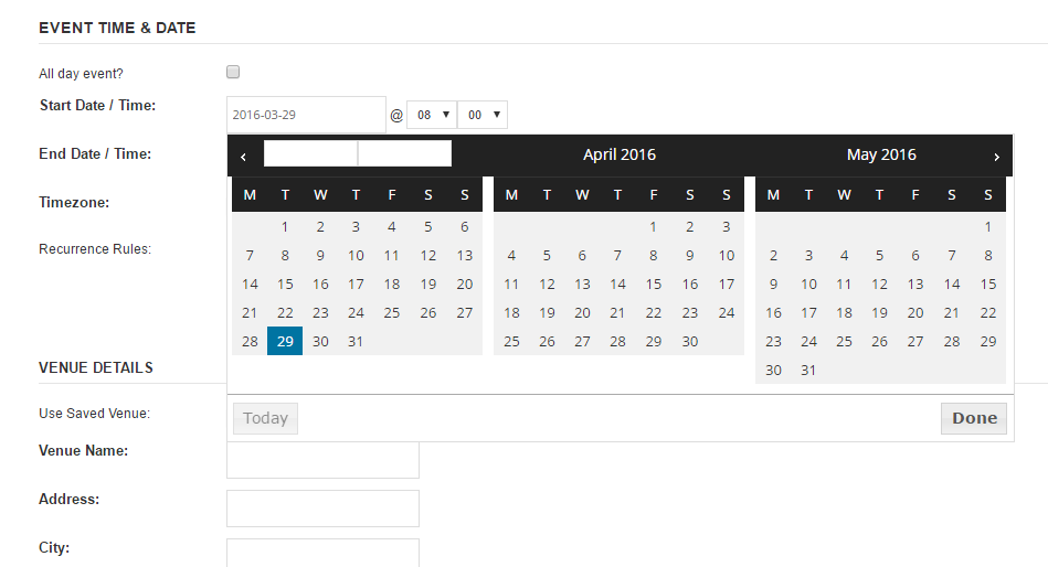
And here’s Firefox:
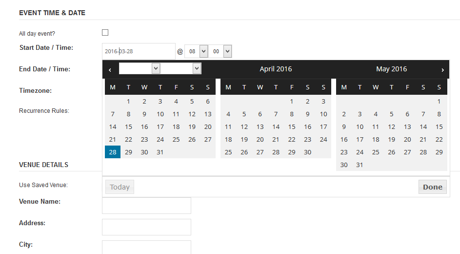
When there is a discrepancy like this sometimes it stems from having different fonts on our systems. For instance tou might have a font named “Open Sans” on our system that is different than the one mine loaded (the one on my computer was loaded dynamically from Google Fonts). If your Open Sans is wider than the one specified on Google then it can cause rendering issues like this.
I’m working a bit blind here since I can’t see the problem. But this code might help improve things:
.ui-datepicker-multi .ui-datepicker-group table.ui-datepicker-calendar {
width: 90%;
margin: 0;
}
Did that make things a little better, maybe eliminate the issue?
- Brook
March 29, 2016 at 11:01 am #1095542ParticipantBrook,
The screenshot you sent me is perfectly formatted. Now I’m completely bewildered. I added all your CSS suggestions, disabled the Mad Mimi plugin, changed to a narrower font, then tested the submission page on PC, tablet, and Mac–no changes at all to the formatting.
Are you positive you’re looking at http://localgetaways.com/events/california/add ? I’ve allowed anonymous submissions again, so please show me a screenshot that include this URL.
I understand that the Trendy Travel WordPress Theme CSS is my concern, but before I spend hours trying to sort it out, I want to make sure there’s not a simple solution.
– Matt
March 30, 2016 at 3:20 pm #1096137ParticipantHowdy Matt,
That was the problem. I’m sorry I did not realize we had started talking about a different URL than the original nordiclarp one.
I can not login to that URL to view the drop down. But it’s likely the solution will be just a little bit of CSS again, nothing too complicated. Could you temporarily grant us access again?
Sorry again for the confusion on my end.
- Brook
-
AuthorPosts
- The topic ‘Formatting of Submit An Event Page’ is closed to new replies.