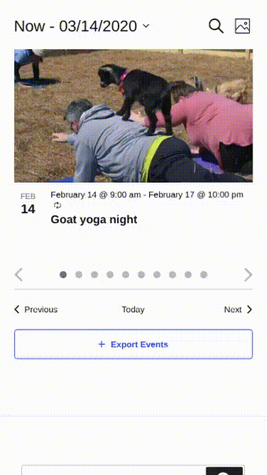
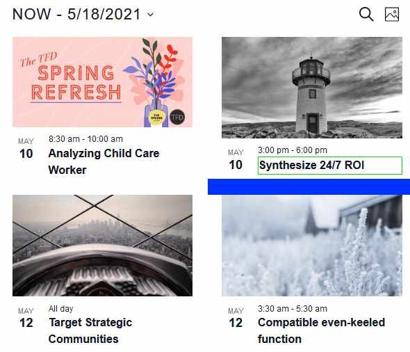
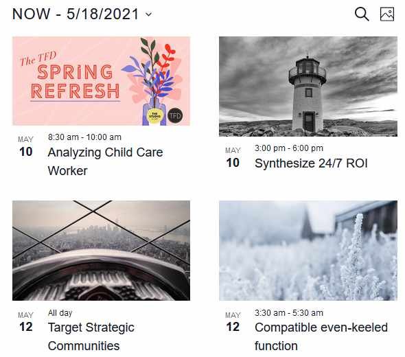
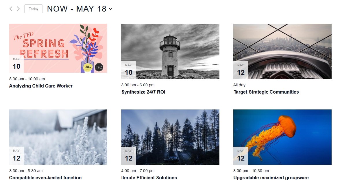
Photo View is a feature of Events Calendar Pro that displays events as a tiled image grid — ideal when your events have featured images. This article collects all Photo View customization recipes: the grid layout setting and aspect ratio, changing image sizes, replacing the default placeholder image, CSS and template styling, and an advanced example for converting Photo View into a touch-friendly slider on mobile.
Unless otherwise noted, PHP snippets can be added via your child theme’s functions.php file or using the Code Snippets plugin. Template overrides should always be placed in a child theme. See Best Practices for Implementing Custom Code Snippets and Customizing Template Files for background on both approaches.
Grid Layout and Aspect Ratio
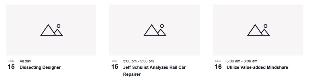
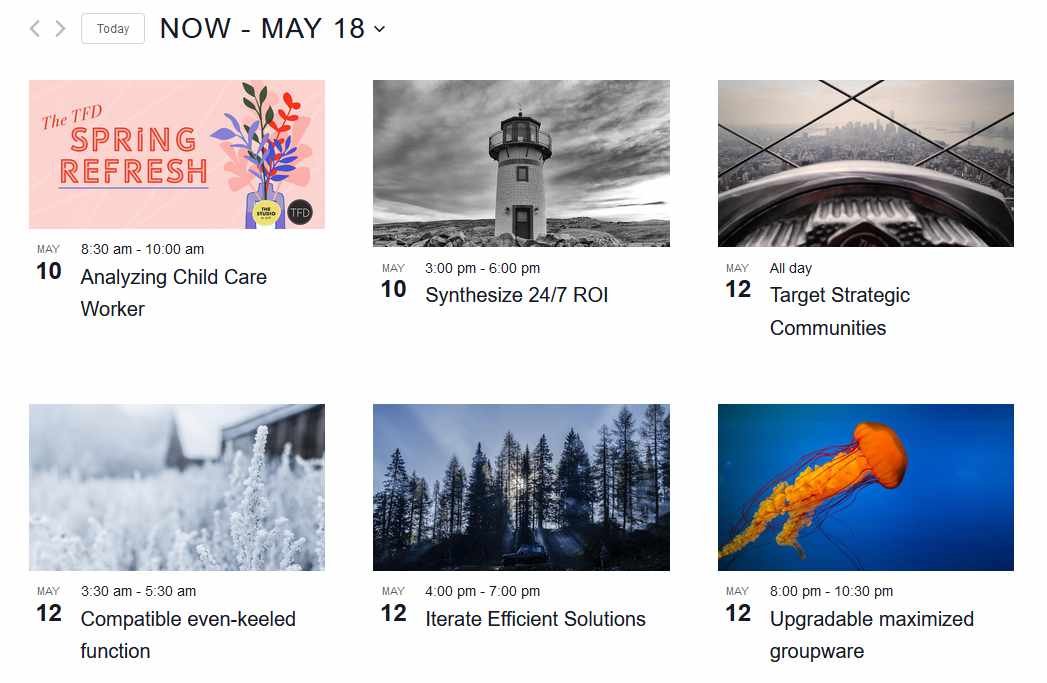
Events Calendar Pro includes a setting to display Photo View images in a uniform grid with a consistent 16:9 aspect ratio, giving your calendar a cleaner, more organized appearance.
Enabling the Grid Layout
To enable the grid option:
- Navigate to Events → Settings → Display in your WordPress dashboard.
- Locate the option labeled “Display images as a grid on Photo View”.
- Check the option to activate the grid layout.
Once enabled, all event images in Photo View will be displayed at a consistent 16:9 aspect ratio.
Changing the Aspect Ratio
If 16:9 doesn’t fit your design, you can adjust the aspect ratio using CSS. The padding-top percentage controls the ratio: divide the height by the width and multiply by 100.
- 16:9 (default):
(9 ÷ 16) × 100 = 56.25% - 4:3:
(3 ÷ 4) × 100 = 75% - 1:1 (square):
(1 ÷ 1) × 100 = 100%
To change to 4:3, add the following to Appearance → Customize → Additional CSS or your child theme’s stylesheet:
.tribe-events-view--photo.tribe-events-pro.tribe-events-pro-photo--grid
.tribe-events-pro-photo__event
.tribe-events-pro-photo__event-featured-image-link {
    padding-top: 75%;
}
Changing the Image Size
By default, Photo View pulls the full-sized image and resizes it to a specific aspect ratio, which can result in inconsistently sized images across the grid. You can override this with a template override that specifies a different WordPress image size.
Create the Template Override
Find the event template file in the plugin:
wp-content/plugins/events-calendar-pro/src/view/v2/photo/event.php
Copy it to your child theme at:
[your-theme]/tribe/events-pro/v2/photo/event.php
Update the Image Call
Open the copied file and locate this line around line 28:
<?php $this->template( 'photo/event/featured-image', [ 'event' => $event ] ); ?>
Replace it with:
<?php echo tribe_event_featured_image( $event->ID, 'thumbnail' ); ?>
Replace 'thumbnail' with any registered WordPress image size: 'medium', 'large', or a custom size name. Standard WordPress sizes are defined at WordPress Settings → Media.
Registering a Custom Cropped Size
If you want a custom size that is cropped to exact dimensions, register it in your theme’s functions.php:
add_image_size( 'custom-size', 220, 180, true );
The true value enables hard cropping. You can then use 'custom-size' as the size name in the template override above.
👋 Note: Images uploaded before the new size was registered will not automatically have that size generated. Use the Perfect Images plugin or a similar regenerate-thumbnails tool to create the new sizes for existing uploads. If you continue to have sizing issues, the My Eyes Are Up Here plugin may also help.
For further reading on template customization, see:
Changing the Default Placeholder Image
When an event has no featured image, Photo View displays a built-in placeholder. You can replace that placeholder with your own image using a simple PHP filter.
First, upload your desired image to your WordPress media library and copy its URL (use the Copy URL button in the media library).
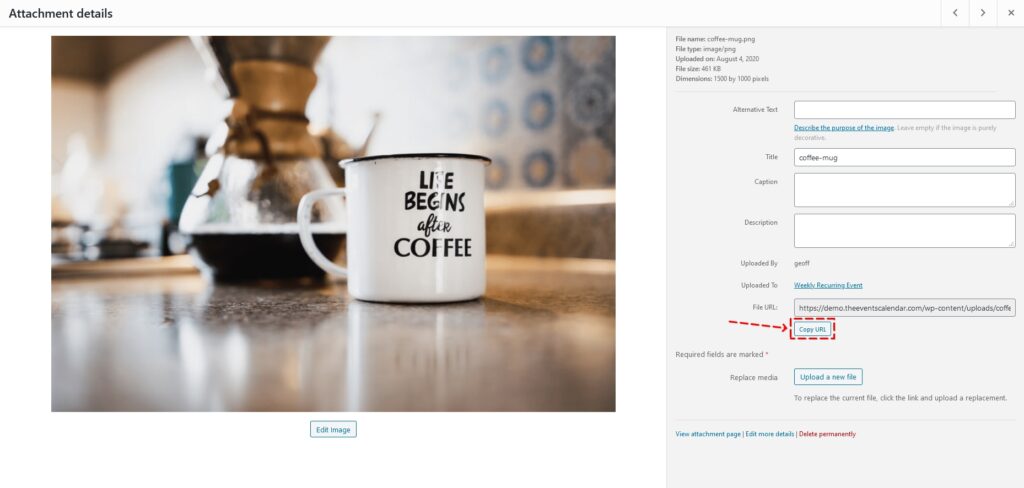
Then add the following snippet to your functions.php file, replacing the URL on line 3 with your own:
add_filter( 'tribe_events_views_v2_view_template_vars', 'tribe_custom_default_featured_image' );

function tribe_custom_default_featured_image( $template_vars ) {
    $template_vars['placeholder_url'] = 'https://your-site.com/wp-content/uploads/your-image.jpg';
    return $template_vars;
}

Styling Photo View with CSS and Templates
Photo View’s templates and CSS are intentionally structured as a strong starting point that you can build on. The following examples walk through CSS-only changes and a template override for a more structural change.
Adjusting Title Font and Event Spacing
To increase the event title font size, reduce its weight, and increase the spacing between events, add the following CSS to your child theme’s stylesheet or Appearance → Customize → Additional CSS.
Note the use of .tribe-common--breakpoint-medium: this class functions like a media query, applied by the plugin when the view container breaks from mobile to desktop size (not based on screen width directly).
.tribe-events-pro .tribe-events-pro-photo__event-title {
    font-size: 18px;
    font-weight: normal;
}

.tribe-common--breakpoint-medium.tribe-events-pro .tribe-events-pro-photo__event-title {
    font-size: 20px;
}

.tribe-events-pro .tribe-events-pro-photo__event {
    margin-bottom: 30px;
}

.tribe-common--breakpoint-medium.tribe-events-pro .tribe-events-pro-photo__event {
    margin-bottom: 60px;
}
If you are using the Twenty Nineteen theme (or another theme that applies its own overrides to event styles), the spacing changes above may not display. To counter this, replace the general selectors with theme-specific ones. For Twenty Nineteen:
.tribe-theme-twentynineteen .tribe-events-pro .entry.tribe-common-g-col.tribe-events-pro-photo__event {
    margin-bottom: 30px;
}

.tribe-theme-twentynineteen .tribe-events-pro.tribe-common--breakpoint-medium .entry.tribe-common-g-col.tribe-events-pro-photo__event {
    margin-bottom: 60px;
}
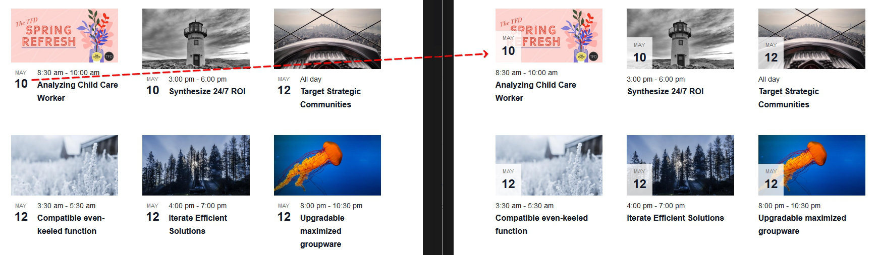
Moving the Date Tag Inside the Photo Card
By default, the date tag appears beside the photo. The following template override moves it on top of the image itself.
This requires overriding two template files.
Step 1: Override event.php
Copy:
/wp-content/plugins/events-pro/src/views/v2/photo/event.php
to:
[your-theme]/tribe/events-pro/v2/photo/event.php
Remove the line that calls the date-tag template so the file looks like this:
<?php
$classes = get_post_class( [ 'tribe-common-g-col', 'tribe-events-pro-photo__event' ], $event->ID );

if ( $event->featured ) {
    $classes[] = 'tribe-events-pro-photo__event--featured';
}
?>
<article <?php tribe_classes( $classes ) ?>>

    <?php $this->template( 'photo/event/featured-image', [ 'event' => $event ] ); ?>

    <div class="tribe-events-pro-photo__event-details-wrapper">
        <div class="tribe-events-pro-photo__event-details">
            <?php $this->template( 'photo/event/date-time', [ 'event' => $event ] ); ?>
            <?php $this->template( 'photo/event/title', [ 'event' => $event ] ); ?>
            <?php $this->template( 'photo/event/cost', [ 'event' => $event ] ); ?>
        </div>
    </div>

</article>
Step 2: Override featured-image.php
Copy:
/wp-content/plugins/events-pro/src/views/v2/photo/event/featured-image.php
to:
[your-theme]/tribe/events-pro/v2/photo/event/featured-image.php
Replace the contents with the following, which builds the image with the date tag overlaid inside the link wrapper:
<?php
use Tribe__Date_Utils as Dates;

$image_url = $event->thumbnail->exists ? $event->thumbnail->full->url : $placeholder_url;

$display_date = empty( $is_past ) && ! empty( $request_date )
    ? max( $event->dates->start_display, $request_date )
    : $event->dates->start_display;

$event_month     = $display_date->format_i18n( 'M' );
$event_day_num   = $display_date->format_i18n( 'j' );
$event_date_attr = $display_date->format( Dates::DBDATEFORMAT );
?>
<div class="tribe-events-pro-photo__event-featured-image-wrapper">
    <a
        href="<?php echo esc_url( $event->permalink ); ?>"
        title="<?php echo esc_attr( get_the_title( $event ) ); ?>"
        rel="bookmark"
        class="tribe-events-pro-photo__event-featured-image-link"
    >
        <img
            src="<?php echo esc_url( $image_url ); ?>"
            <?php if ( ! empty( $event->thumbnail->srcset ) ) : ?>
                srcset="<?php echo esc_attr( $event->thumbnail->srcset ); ?>"
            <?php endif; ?>
            <?php if ( ! empty( $event->thumbnail->alt ) ) : ?>
                alt="<?php echo esc_attr( $event->thumbnail->alt ); ?>"
            <?php endif; ?>
            <?php if ( ! empty( $event->thumbnail->title ) ) : ?>
                title="<?php echo esc_attr( $event->thumbnail->title ); ?>"
            <?php endif; ?>
            class="tribe-events-pro-photo__event-featured-image"
        />
        <div class="tribe-events-pro-photo__event-featured-image-date-tag">
            <time
                class="tribe-events-pro-photo__event-featured-image-date-tag-datetime"
                datetime="<?php echo esc_attr( $event_date_attr ); ?>"
            >
                <span class="tribe-events-pro-photo__event-featured-image-date-tag-month">
                    <?php echo esc_html( $event_month ); ?>
                </span>
                <span class="tribe-events-pro-photo__event-featured-image-date-tag-daynum tribe-common-h5 tribe-common-h4--min-medium">
                    <?php echo esc_html( $event_day_num ); ?>
                </span>
            </time>
        </div>
    </a>
</div>
Step 3: Add the CSS
Add the following to your stylesheet or Appearance → Customize → Additional CSS to position the date tag over the image:
.tribe-events-pro .tribe-events-pro-photo__event-featured-image-link {
    position: relative;
}

.tribe-events-pro .tribe-events-pro-photo__event-featured-image-date-tag {
    position: absolute;
    bottom: 0;
    left: 0;
    background-color: rgba(255, 255, 255, 0.8);
    padding: 6px 12px;
}

.tribe-events-pro .tribe-events-pro-photo__event-featured-image-date-tag-datetime {
    display: flex;
    flex-direction: column;
    text-align: center;
}

.tribe-events-pro .tribe-events-pro-photo__event-featured-image-date-tag-month {
    color: #727272;
    font-family: "Helvetica Neue", Helvetica, -apple-system, BlinkMacSystemFont, Roboto, Arial, sans-serif;
    font-size: 11px;
    font-weight: 400;
    line-height: 1.5;
    text-transform: uppercase;
}
Advanced: Mobile Slider
This example converts Photo View into a touch-friendly slider on small screens while preserving the standard grid layout on desktop. It uses the Swiper slider library and hooks into The Events Calendar’s built-in JavaScript resize event system, which applies breakpoint classes to the view container rather than relying on CSS media queries.
The slider adapts to device orientation: portrait shows one event at a time with navigation; landscape shows two events per slide.
Step 1: Override the Template Files
Copy the following two files from the plugin to your child theme:
/wp-content/plugins/events-pro/src/views/v2/photo.php
→ [your-theme]/tribe/events-pro/v2/photo.php

/wp-content/plugins/events-pro/src/views/v2/photo/event.php
→ [your-theme]/tribe/events-pro/v2/photo/event.php
Step 2: Edit photo.php
Replace the contents of your photo.php override with the following. The key changes are wrapping the events container in Swiper classes (swiper-container, swiper-wrapper) and adding navigation and pagination elements:
<?php
$header_classes = [ 'tribe-events-header' ];
if ( empty( $disable_event_search ) ) {
    $header_classes[] = 'tribe-events-header--has-event-search';
}
?>
<div
    <?php tribe_classes( $container_classes ); ?>
    data-js="tribe-events-view"
    data-view-rest-nonce="<?php echo esc_attr( $rest_nonce ); ?>"
    data-view-rest-url="<?php echo esc_url( $rest_url ); ?>"
    data-view-manage-url="<?php echo esc_attr( $should_manage_url ); ?>"
    <?php foreach ( $container_data as $key => $value ) : ?>
    data-view-<?php echo esc_attr( $key ) ?>="<?php echo esc_attr( $value ) ?>"
    <?php endforeach; ?>
    <?php if ( ! empty( $breakpoint_pointer ) ) : ?>
    data-view-breakpoint-pointer="<?php echo esc_attr( $breakpoint_pointer ); ?>"
    <?php endif; ?>
>
    <div class="tribe-common-l-container tribe-events-l-container">
        <?php $this->template( 'components/loader', [ 'text' => __( 'Loading...', 'tribe-events-calendar-pro' ) ] ); ?>
        <?php $this->template( 'components/data' ); ?>
        <?php $this->template( 'components/before' ); ?>

        <header <?php tribe_classes( $header_classes ); ?>>
            <?php $this->template( 'components/messages' ); ?>
            <?php $this->template( 'components/breadcrumbs' ); ?>
            <?php $this->template( 'components/events-bar' ); ?>
            <?php $this->template( 'photo/top-bar' ); ?>
        </header>

        <?php $this->template( 'components/filter-bar' ); ?>

        <div class="tribe-events-pro-photo swiper-container">
            <div class="tribe-events-pro-photo__events tribe-common-g-row tribe-common-g-row--gutters swiper-wrapper">
                <?php foreach ( $events as $event ) : ?>
                    <?php $this->setup_postdata( $event ); ?>
                    <?php $this->template( 'photo/event', [ 'event' => $event ] ); ?>
                <?php endforeach; ?>
            </div>

            <button class="swiper-button-prev tribe-common-c-btn-icon tribe-common-c-btn-icon--caret-left"></button>
            <button class="swiper-button-next tribe-common-c-btn-icon tribe-common-c-btn-icon--caret-right"></button>
            <div class="swiper-pagination"></div>
        </div>

        <?php $this->template( 'photo/nav' ); ?>
        <?php $this->template( 'components/ical-link' ); ?>
        <?php $this->template( 'components/after' ); ?>
    </div>
</div>

<?php $this->template( 'components/breakpoints' ); ?>
Step 3: Edit event.php
Update your event.php override to add the swiper-slide class to each event article:
<?php
$classes = get_post_class( [ 'tribe-common-g-col', 'tribe-events-pro-photo__event', 'swiper-slide' ], $event->ID );

if ( $event->featured ) {
    $classes[] = 'tribe-events-pro-photo__event--featured';
}
?>
<article <?php tribe_classes( $classes ) ?>>

    <?php $this->template( 'photo/event/featured-image', [ 'event' => $event ] ); ?>

    <div class="tribe-events-pro-photo__event-details-wrapper">
        <?php $this->template( 'photo/event/date-tag', [ 'event' => $event ] ); ?>
        <div class="tribe-events-pro-photo__event-details">
            <?php $this->template( 'photo/event/date-time', [ 'event' => $event ] ); ?>
            <?php $this->template( 'photo/event/title', [ 'event' => $event ] ); ?>
            <?php $this->template( 'photo/event/cost', [ 'event' => $event ] ); ?>
        </div>
    </div>

</article>
Step 4: Add the CSS
Add the following to your child theme’s stylesheet or Appearance → Customize → Additional CSS. On mobile the events are displayed as a flat horizontal row for the slider; on desktop they revert to the standard wrapped grid. Navigation and pagination elements are hidden on desktop.
.tribe-events-pro .tribe-events-pro-photo {
    margin: 0 -21px;
    overflow: hidden;
    position: relative;
}

.tribe-common--breakpoint-medium.tribe-events-pro .tribe-events-pro-photo {
    margin: 0;
    padding: 0;
}

.tribe-events-pro .tribe-events-pro-photo__events {
    flex-wrap: nowrap;
    margin: 0;
}

.tribe-common--breakpoint-medium.tribe-events-pro .tribe-events-pro-photo__events {
    flex-wrap: wrap;
}

.tribe-events-pro .tribe-events-pro-photo__event {
    flex: none;
}

.tribe-events-pro .tribe-events-pro-photo .swiper-pagination {
    display: flex;
    justify-content: center;
    padding: 15px 16px;
}

.tribe-events-pro .tribe-events-pro-photo .swiper-pagination-bullet {
    background-color: #bababa;
    border-radius: 50%;
    flex: none;
    height: 10px;
    margin: 0 6px;
    width: 10px;
}

.tribe-events-pro .tribe-events-pro-photo .swiper-pagination-bullet:hover,
.tribe-events-pro .tribe-events-pro-photo .swiper-pagination-bullet:focus,
.tribe-events-pro .tribe-events-pro-photo .swiper-pagination-bullet-active {
    background-color: #727272;
}

.tribe-events-pro .tribe-events-pro-photo .swiper-button-prev,
.tribe-events-pro .tribe-events-pro-photo .swiper-button-next {
    position: absolute;
    bottom: 10px;
}

.tribe-events-pro .tribe-events-pro-photo .swiper-button-prev {
    left: 21px;
}

.tribe-events-pro .tribe-events-pro-photo .swiper-button-next {
    right: 21px;
}

.tribe-common--breakpoint-medium.tribe-events-pro .tribe-events-pro-photo .swiper-pagination,
.tribe-common--breakpoint-medium.tribe-events-pro .tribe-events-pro-photo .swiper-button-prev,
.tribe-common--breakpoint-medium.tribe-events-pro .tribe-events-pro-photo .swiper-button-next {
    display: none;
    visibility: hidden;
}
Step 5: Create the JavaScript File
Create the file at [your-theme]/assets/js/photo-swiper.js (adjust the path if you prefer a different location). This script listens for TEC’s resize.tribeEvents event — which fires after the plugin has processed breakpoint state — and initializes or destroys the Swiper instance based on whether the container is in mobile view. The isMobile state variable is set by TEC’s breakpoint system before the event fires, making it reliable for this purpose.
var photoSwiper = {};

( function( $, obj ) {
    'use strict';
    var $document = $( document );

    obj.selectors = {
        slider: '.tribe-events-pro-photo.swiper-container',
    };

    obj.instances = {};

    obj.deinitSwiper = function( $container ) {
        var uid = $container.attr( 'data-view-breakpoint-pointer' );
        $container.find( obj.selectors.slider ).each( function( index, slider ) {
            if ( ! obj.instances[ uid + '-' + index ] ) {
                return;
            }
            obj.instances[ uid + '-' + index ].destroy();
        } );
    };

    obj.initSwiper = function( $container ) {
        var uid = $container.attr( 'data-view-breakpoint-pointer' );
        $container.find( obj.selectors.slider ).each( function( index, slider ) {
            if ( obj.instances[ uid + '-' + index ] && obj.instances[ uid + '-' + index ].initialized ) {
                return;
            }
            obj.instances[ uid + '-' + index ] = new Swiper( slider, {
                slidesPerView: 'auto',
                navigation: {
                    prevEl: slider.querySelector( '.swiper-button-prev' ),
                    nextEl: slider.querySelector( '.swiper-button-next' ),
                },
                pagination: {
                    el: '.swiper-pagination',
                    type: 'bullets',
                    bulletElement: 'button',
                    clickable: true,
                }
            } );
        } );
    };

    obj.setSwiper = function( $container ) {
        var containerState = $container.data( 'tribeEventsState' );
        var isMobile = containerState.isMobile;

        if ( isMobile ) {
            obj.initSwiper( $container );
        } else {
            obj.deinitSwiper( $container );
        }
    };

    obj.handleResize = function( event ) {
        obj.setSwiper( event.data.container );
    };

    obj.bindEvents = function( $container ) {
        $container.on( 'resize.tribeEvents', { container: $container }, obj.handleResize );
    };

    obj.deinit = function( event, jqXHR, settings ) {
        var $container = event.data.container;
        obj.deinitSwiper( $container );
        $container.off( 'beforeAjaxSuccess.tribeEvents', obj.deinit );
    };

    obj.init = function( event, index, $container, data ) {
        var $sliders = $container.find( obj.selectors.slider );

        if ( ! $sliders.length ) {
            return;
        }

        obj.setSwiper( $container );
        obj.bindEvents( $container );
        $container.on( 'beforeAjaxSuccess.tribeEvents', { container: $container }, obj.deinit );
    };

    obj.ready = function( event ) {
        const manager = tribe.events.views.manager;
        manager.$containers.each( function( index, container ) {
            var $container = $( container );
            obj.init( event, index, $container, manager.getContainerData( $container ) );
        } );
        $document.on( 'afterSetup.tribeEvents', manager.selectors.container, obj.init );
    };

    $document.ready( obj.ready );
} )( jQuery, photoSwiper );
Step 6: Enqueue the Scripts
Add the following to your child theme’s functions.php. This loads Swiper from a CDN and then loads your custom slider script, declaring Swiper and TEC’s viewport script as dependencies:
function add_photo_swiper_js() {
    wp_enqueue_script(
        'swiper-js',
        'https://cdnjs.cloudflare.com/ajax/libs/Swiper/4.5.1/js/swiper.min.js',
        [ 'tribe-events-views-v2-viewport' ],
        false,
        true
    );
    wp_enqueue_script(
        'custom-photo-swiper-js',
        get_stylesheet_directory_uri() . '/assets/js/photo-swiper.js',
        [ 'swiper-js' ],
        false,
        true
    );
}
add_action( 'wp_enqueue_scripts', 'add_photo_swiper_js' );
Visit your Photo View page — you should see a slider on mobile and the standard grid on desktop.