The month view is an essential part of The Events Calendar and one of the most commonly used views. Here is a list of CSS class selectors that you can use to format the different days in the grid. We’ve also included a couple of example attributes for each.
If you haven’t yet – please read Customizing Mobile Styles for clarity on what we mean when we say “mobile” or “desktop” – it’s not the screen size, but the container size that counts!
Notice a pattern? Our CSS selectors follow a pattern that makes it easier to figure out what they’re for when you see them in the stylesheet. The pattern we use is a modified version of BEM.
Styling cells
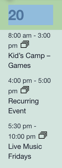
A “cell” is the square background of a single day on the month view grid where the events for a day are listed. Think of it as a single cell in a large grid of cells.
General styling class
The following is a general class that can be used to style any date on the month view grid, whether it’s past, present, or current.
.tribe-events-calendar-month__day-cell {
    background-color: #fff; /* to change the background color */
    border-color: #000;/* To change the border color */
}
Styling cells on small screens
The following class can be used to adjust the styling of a month view cell on screens that are 768px and below, like tablets and mobile smaller mobile devices.
.tribe-events-calendar-month__day-cell--mobile {
  background-color: #fff; /* Change the background color */
  border-color: #000;/* Change the border color */
}
Styling cells on large screens
The following class can be used to adjust the styling of a month view cell on screens that are 768px and above, like desktop computer screens.
.tribe-events-calendar-month__day-cell--desktop {
  background-color: #fff; /* Changes the background color */
  border-color: #000;/* Changes the border color */
}
Styling days in the past
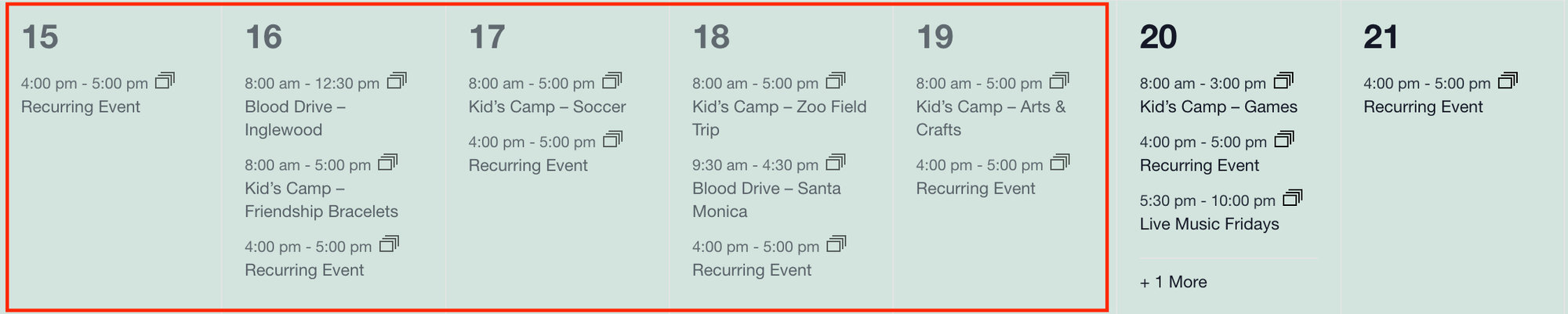
This affects both this month’s past days, including days from the previous month.
.tribe-events-calendar-month__day--past {
  background-color: #fff; /* Changes the background color */
  border-color: #000;/* Changes the border color */
}
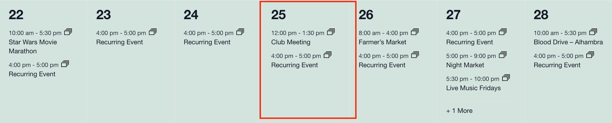
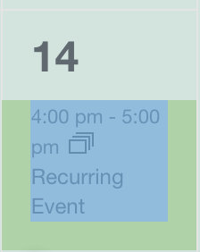
Styling the current date
The following class can be used to style the month view cell that contains the current date.
.tribe-events-calendar-month__day--current {
  background-color: #fff; /* Changes the background color */
  border-color: #000;/* Changes the border color */
}
Combining style classes
You can combine these. Be sure to always call the time first, then screen size (and don’t forget the space between classes).
For example, this is styling cells that are in the past on desktop screens:
.tribe-events-calendar-month__day--past .tribe-events-calendar-month__day-cell--desktop {
  background-color: #fff; /* to change the background color */
  border-color: #000;/* To change the border color */
}
Styling cell sections
<h3>) and a list of events taking place that day (<div>).A day cell is divided into two sections: a Heading 3 (<h3>) element that contains the day number, and a container (<div>) element that contains the events taking place on that date. These can also be targeted via CSS. However, both are modified by the cell classes (as are their contents), so they’ll need to be combined with the above to be really effective!
Styling the date heading
.tribe-events-calendar-month__day-date {}
Styling the events container
.tribe-events-calendar-month__events {}
Styling events in a date cell
Inside the events section are the events themselves. Each event on the calendar is an article (<article>) element. Inside that element, you’ll find the date and time of the event, the event title, and a tooltip that displays when the event is hovered.
The single event container
.tribe-events-calendar-month__calendar-event { }
Styling the event date and time
.tribe-events-calendar-month__calendar-event-datetime { }
Styling the event title
.tribe-events-calendar-month__calendar-event-title a { }
Styling recurring events
Of course, recurring events be styled on their own!
Styling recurring event instances
.tribe-recurring-event { }
Styling multi-day events
Events that span multiple days? Yep, they can be styled, too! Note that you’ll need to use the tribe-events-calendar-month__multiday-event-bar-inner class to style the background color of the event.
/* We can add a border around the entire event. */
.tribe-events-calendar-month__multiday-event-bar {
  border: 1px solid #20c2ff;
}

/* We can change the background color of the event. */
.tribe-events-calendar-month__multiday-event-bar-inner {
  background-color: #20ff5e;
}

/* We can change the color of the event title. */
.tribe-events-calendar-month__multiday-event-bar-title {
  color: #20ff5e;
}
Style combinations
You can combine any of these to achieve some pretty sweet styles.
Past event and event section
.tribe-events-calendar-month__day--past .tribe-events-calendar-month__calendar-event{ }
Current event and recurring event
.tribe-events-calendar-month__day--current .tribe-events-calendar-month__multiday-event-bar-inner{ }
Current event and recurring event in mobile views
.tribe-events-calendar-month__day--current .tribe-events-calendar-month__day-cell--mobile .tribe-events-calendar-month__multiday-event-bar-inner { }
If you are trying to customize month view in The Events Calendar 4 and earlier, here is a set of separate instructions.
Disclaimer
As with all of our recipes, please note that we share this in the hope it will be useful but without any guarantees or commitments. If you wish to use it, it is your responsibility to test it first of all and adapt it to your needs (or find someone who can do so on your behalf). We are unable to provide further support in relation to this recipe.